Category

Product Design

Company

Gymshark

Gymshark Training App

Main Project Image
Main Project Image

Helping users discover content, build workout habits and track their progress.

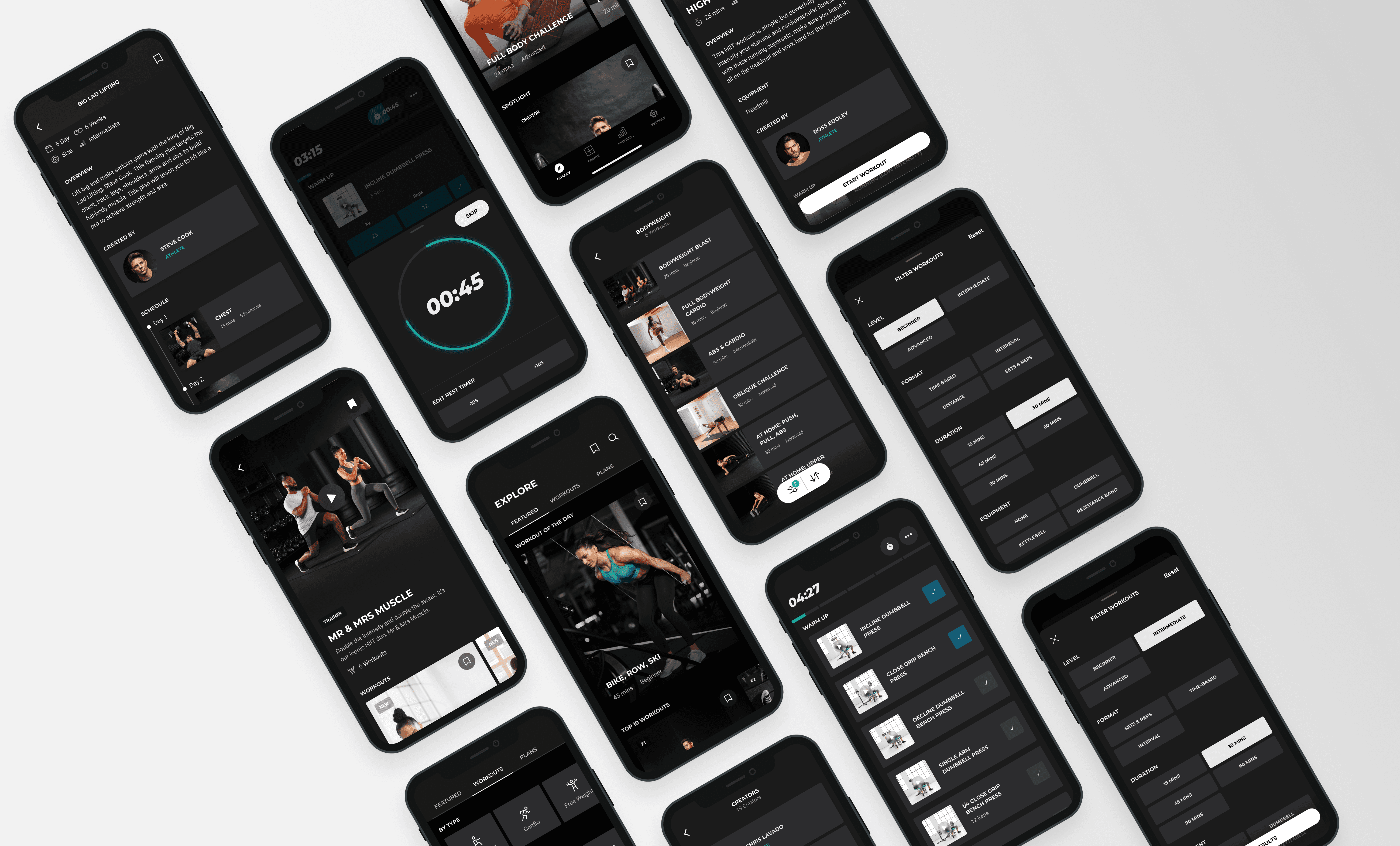
I spent three years as a Product Designer on Gymshark's Training App, rated 4.8 on the App Store and Google Play. I worked across the app's four pillars, Explore, Create, Train and Progress, with a focus on Explore, helping users find, filter and save workout content. I led two of its key features from discovery to launch: Bookmarks, and Sorting & Filtering. Across the wider team, I helped maintain a shared design system for three digital products and created illustrations and icons for product features and marketing campaigns.
Explore

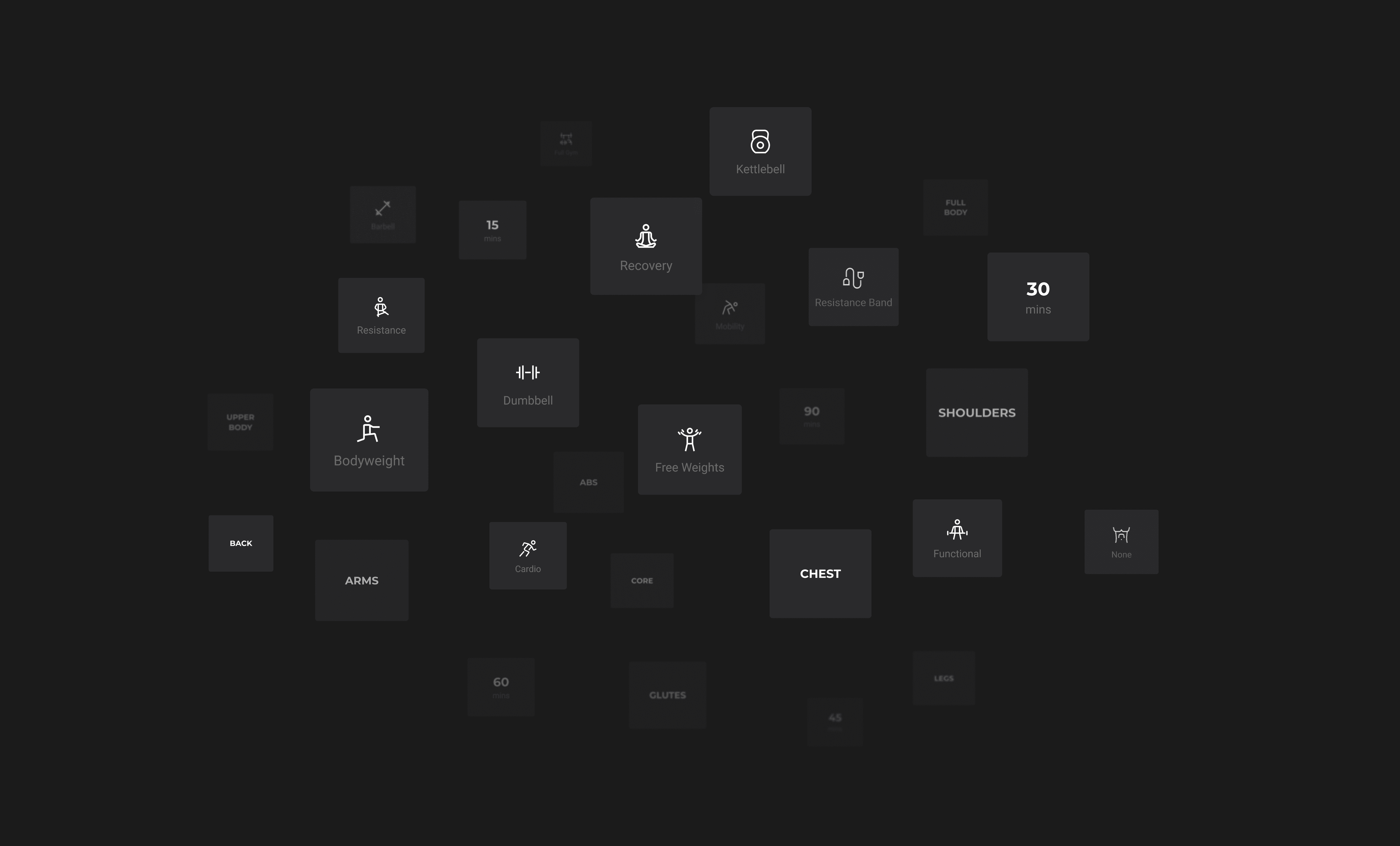
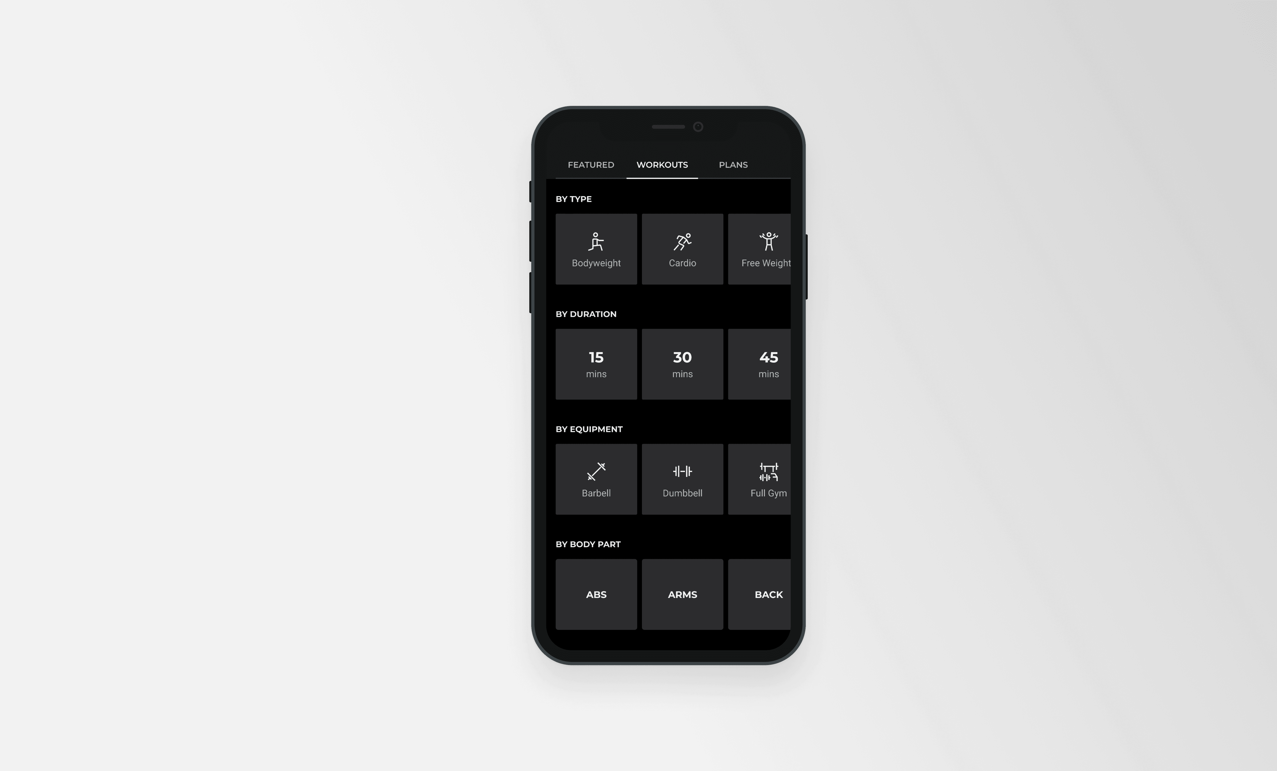
Explore brought Gymshark's workouts and plans into a single browsable space. Users could browse featured, curated content and discover workouts and plans based on their fitness level, equipment and available time. As more content was added, two needs became clear: users wanted a way to save content for later, and a faster way to narrow results down to what suited them.

Explore brought Gymshark's workouts and plans into a single browsable space. Users could browse featured, curated content and discover workouts and plans based on their fitness level, equipment and available time. As more content was added, two needs became clear: users wanted a way to save content for later, and a faster way to narrow results down to what suited them.

Project Gallery Image for 50% width of the screen #1
Project Gallery Image for 50% width of the screen #2

Bookmarks

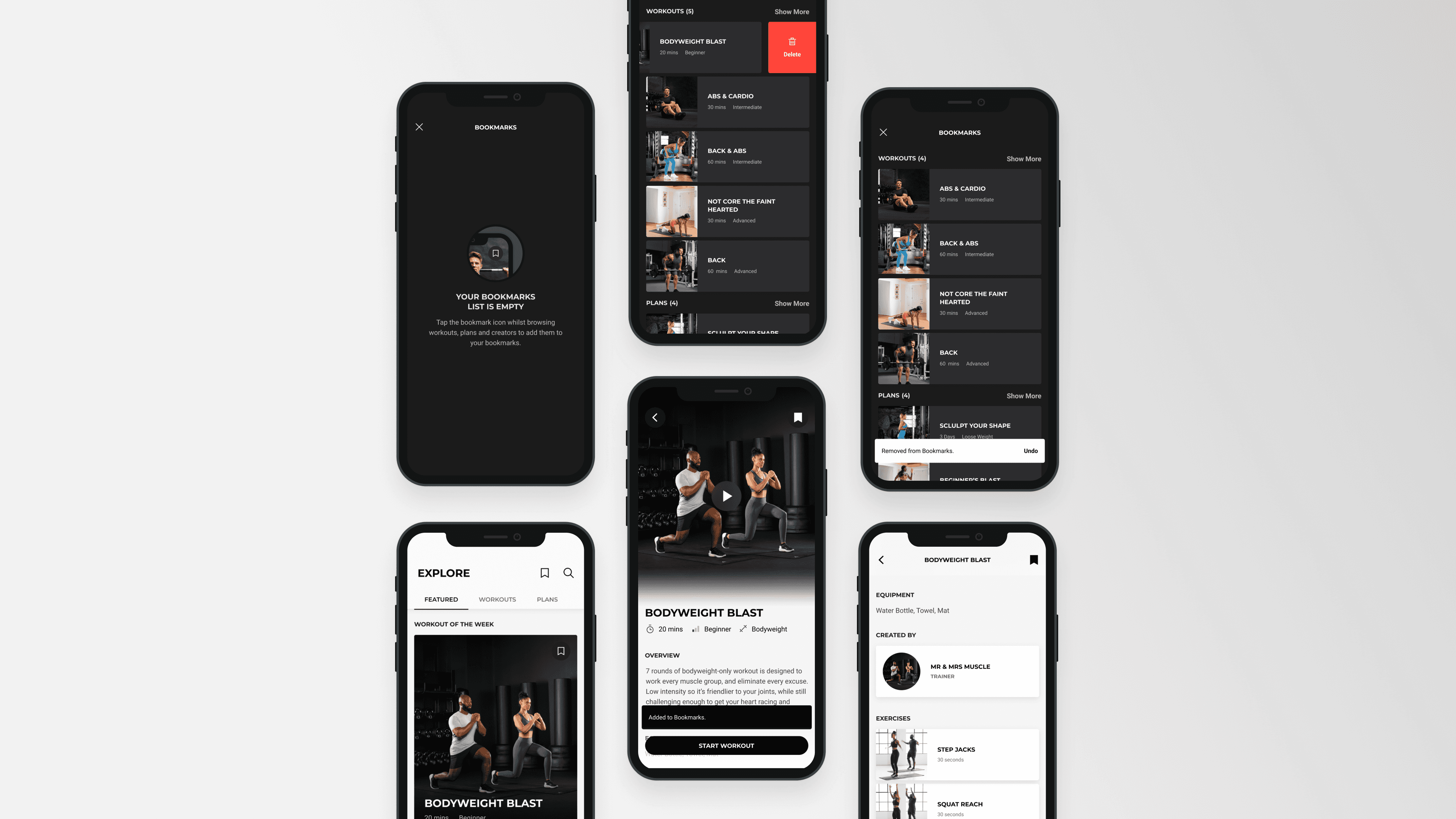
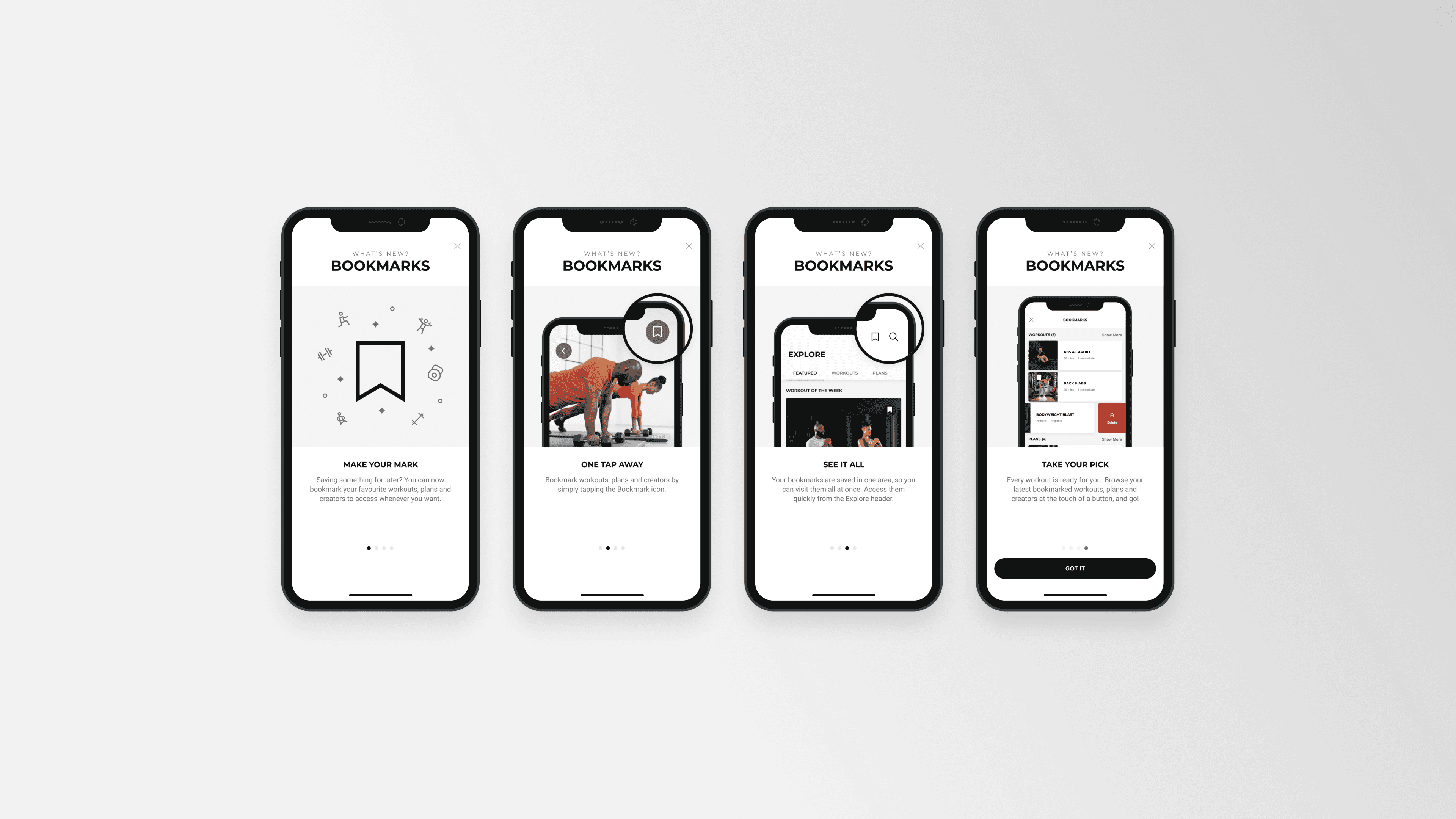
Once Explore launched, content was easier to discover, but users had no way to save it and pick up where they left off. Bookmarking quickly became the most requested feature. I led the design from discovery to delivery. I worked with UX researchers to pull key themes from app store reviews, surveys and interviews, and reviewed bookmarking patterns in other apps. We tested three concepts with users to refine placement, terminology and functionality. I then shaped the full experience, from introducing the feature to saving and managing bookmarks, including which content could be saved and how users got feedback on each action. Users who bookmarked content were more active and more likely to return than those who didn't. New users started 16% more workouts and were 54% stickier, while existing users started 8% more workouts and were 72% stickier.

Once Explore launched, content was easier to discover, but users had no way to save it and pick up where they left off. Bookmarking quickly became the most requested feature. I led the design from discovery to delivery. I worked with UX researchers to pull key themes from app store reviews, surveys and interviews, and reviewed bookmarking patterns in other apps. We tested three concepts with users to refine placement, terminology and functionality. I then shaped the full experience, from introducing the feature to saving and managing bookmarks, including which content could be saved and how users got feedback on each action. Users who bookmarked content were more active and more likely to return than those who didn't. New users started 16% more workouts and were 54% stickier, while existing users started 8% more workouts and were 72% stickier.

Myko prototype showing connected home device controls

Sorting & filtering

Browsing suited discovery, but users looking for something specific needed a faster route. I designed sorting and filtering across iOS and Android, using native platform patterns and parameters including equipment, duration, goal and difficulty level. A floating filter pill kept the controls within reach, with a count showing how many filters were applied.

Browsing suited discovery, but users looking for something specific needed a faster route. I designed sorting and filtering across iOS and Android, using native platform patterns and parameters including equipment, duration, goal and difficulty level. A floating filter pill kept the controls within reach, with a count showing how many filters were applied.